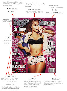
To begin creating my music magazine, I have deconstructed a chosen front cover. I have looked at the layout of this front cover, and annotated each convention.
I have looked closely at a cover which will be similar to my own. I am using Rolling Stones magazine as a guide, so in order to make my magazine like this one, I annotated it in a detailed form for my own help.
This magazine is very professional as it doesn't contain some conventions a typical magazine would. This magazine doesn't include the typical conventions such as; a puff and a pug which are usually used for promotional offers and a tagline which is a catchy memorable phrase associated with the magazine. As this magazine is clearly very feminine, the font is used to help emphasise this. This font is very thin and long, rather than be very bold and block letters.
As I am focusing my magazine on Rolling Stones, I needed to establish the differences between it compared to other music magazines.
I have chosen to compare an issue of Rolling Stones which I will be responding to, to an issue of Q:
* Q contains a lot more text and colour on the front cover, whereas Rolling Stones features one person on the cover with very little text right aligned.
* Q uses a colour format of red, white and black mainly, and Rolling Stones has a format layout of black and white, excluding the masthead. Rolling Stones has a limited amount of colour, whereas the use of red writing 'MADONNA' is striking and jumps out at the audience.
* Both magazine covers use one main image, which supposedly in the main feature. However, Q contains an exclusive offer at the bottom of the cover, with a smaller image. This is also used to make the magazine stand out as it contains a freebie.
* Both magazines uses the same font on the entire magazine cover, just with different colouring.
* The mastheads that are used are both seen as logos - Q's is short and bold, whereas Rolling Stones covers the whole top of the cover.
* It is clear that there are two different target audiences for these magazines, Q is bold and colourful which may signify that it targets a young audience, whereas Rolling Stones is simple and dark which targets an older audience.
* As well as attracting different ages, both the magazines focus themselves on different genres of music.Rolling Stones has a large target audience as it is based on the genre of pop and rock, whereas Q focuses on Popular artists.
* A very important difference is that Rolling Stones is a USA based magazine, a opposed to Q which is a UK based magazine.
This has helped me greatly as I am able to know how to see the differences in music magazines, and also it has helped me in establishing what my music magazine target audience is. Rolling Stones usually features music legends, so I have chosen to feature Lady Gaga. Its target audience will be 20-35 years of age, and people who enjoy the genre of mainstream music, mixed with rock and pop mainly, but also for people who like to read about politics.


